 Watch on YouTube
A personal project, in ten chapters
alextong.me,
over time.
One address. A few different lives.
My personal site has been a one-page placeholder, a Squarespace portfolio, a publication, a moonlit world, and a home for client work. These ten chapters trace its path from 2018 to the current rhino identity.
Design & development by Alex Tong · 2018–202601
A name in neon.
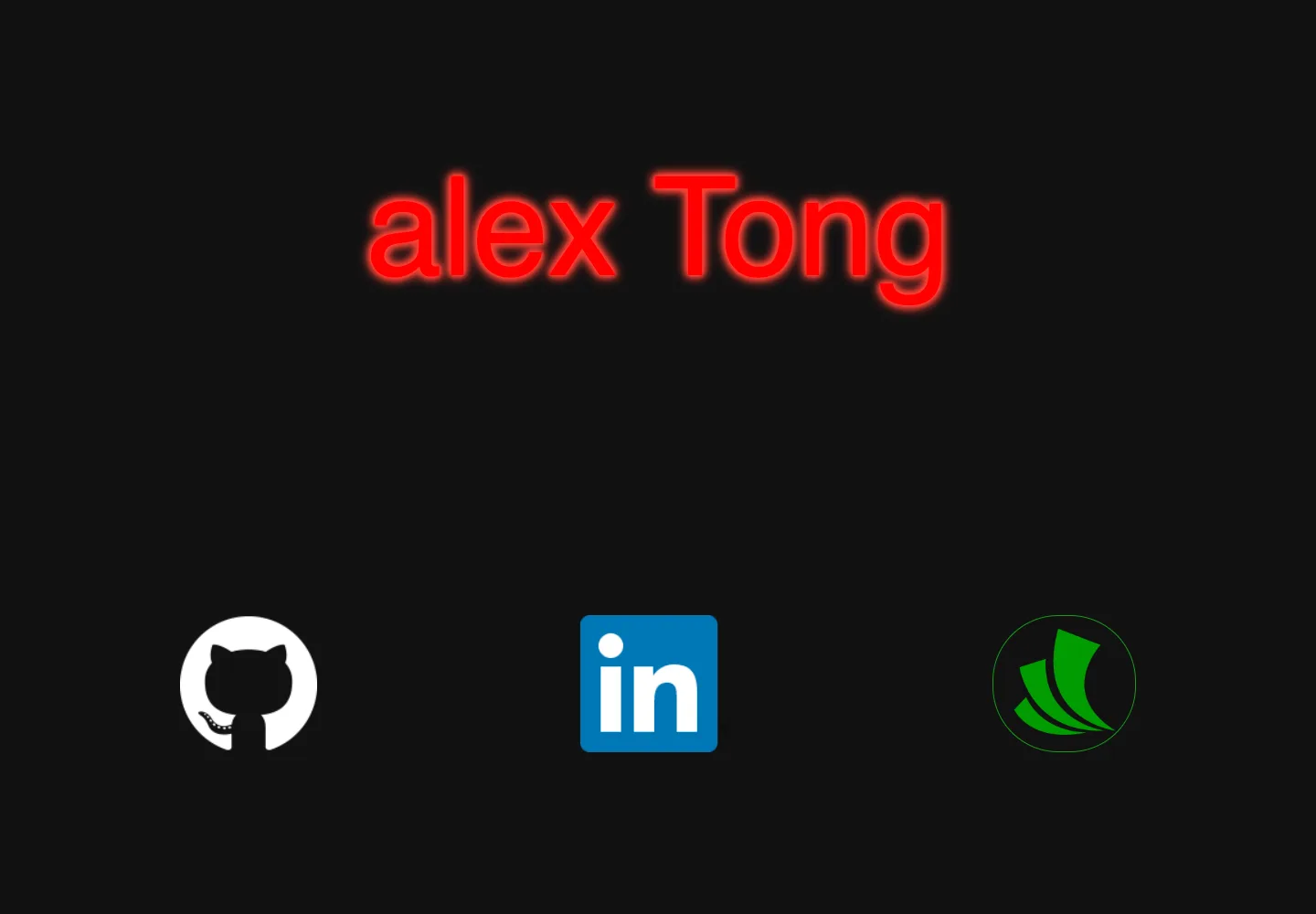
One page, three links
The domain started as a single hand-written HTML page: my name in red neon on black, and three links out. There was nothing to read yet, but the instinct that stuck around was already there. A glowing name, a dark room, and not much else.
Hand-written HTML · Inconsolata · Three links
02
A signature in the dark.
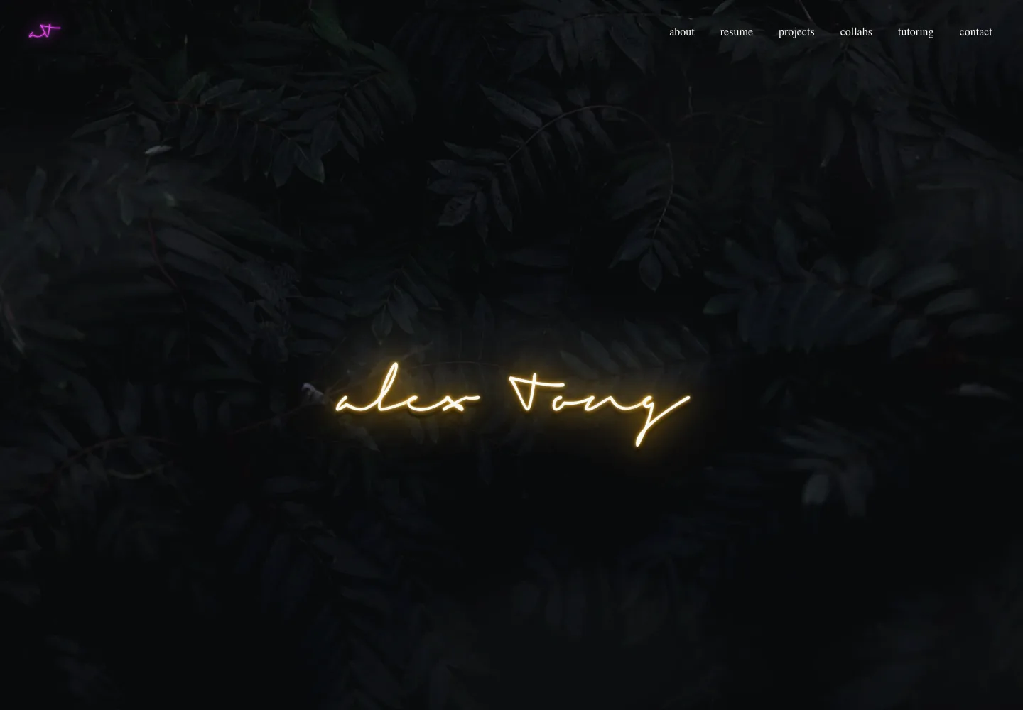
A portfolio with a nightlife feel
When I finished App Academy, the site moved to Squarespace. A handwritten signature glowed over dark foliage, and the menu grew with whatever I was doing at the time: projects, tutoring, a blockchain phase, free tutorials. The backdrop changed a few times over these years, but the neon signature stayed.
Squarespace · Neon signature · Tutoring and projects
03
Chrome and honeycomb.
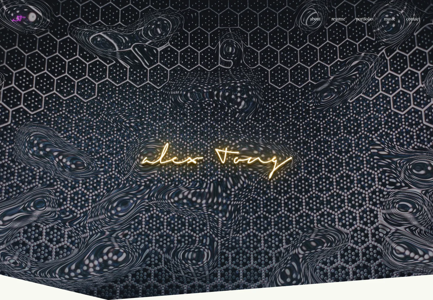
Same signature, louder backdrop
The final Squarespace version kept the signature and swapped the foliage for a warped chrome honeycomb. Free LeetCode tutorials, a shoe page, and a music section came and went. It was the last version before I rebuilt the site by hand in early 2026.
Squarespace · Chrome texture · Music and tutorials
04
A little after dark.
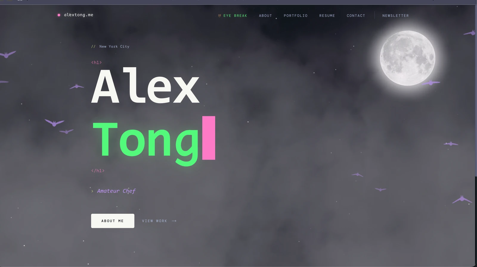
Personality first
The first version put the person before the pitch: a developer portfolio with a Dracula palette, a typewriter-style name, and a sky full of fog and bats. Projects and an introduction did the practical work; the atmosphere made the site feel like mine.
Code typography · Atmospheric motion · Personal projects
05
Room for the writing.
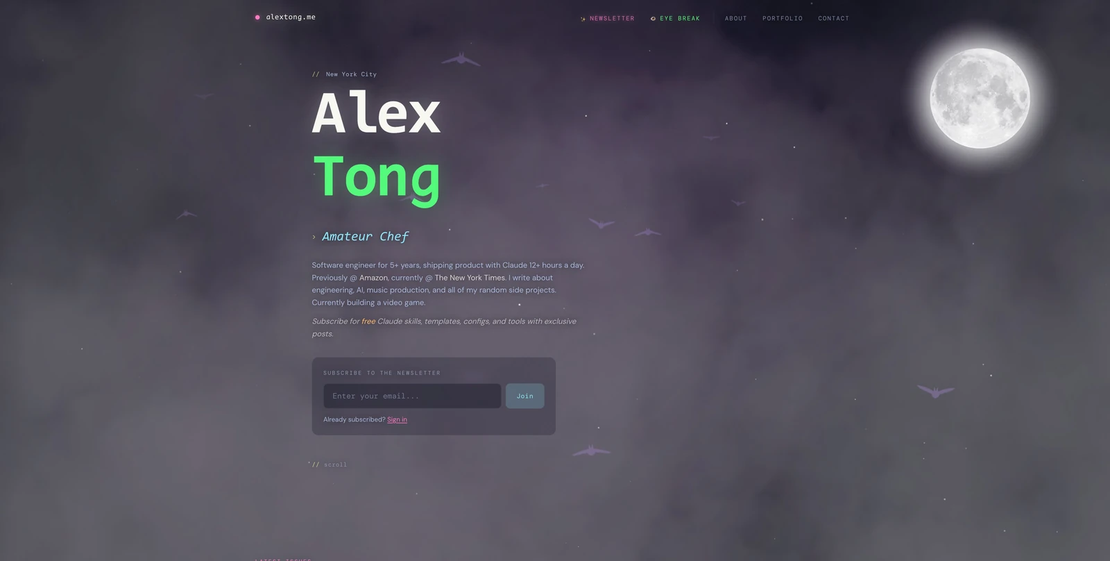
From introduction to invitation
Writing became a bigger part of the site. The name stepped back, the introduction grew, and a newsletter invitation joined the hero. The same nocturnal world now had something to come back for: articles, apps, and ongoing experiments.
Newsletter · Revised hierarchy · Sound and interaction
06
A world of its own.
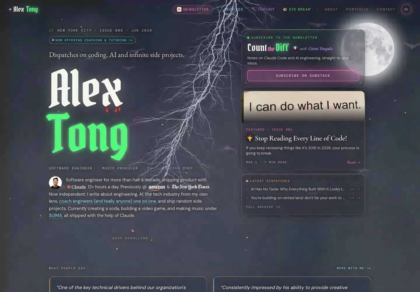
A publication with a character
The code-style heading gave way to a dramatic gothic wordmark. An editorial dateline, featured story, and Dispatch and Workshop sections turned the homepage into a small publication. Glass, a moving sky, and occasional lightning strikes became part of a more complete visual world.
Gothic typography · Editorial layout · Procedural lightning
07
A different kind of daylight.
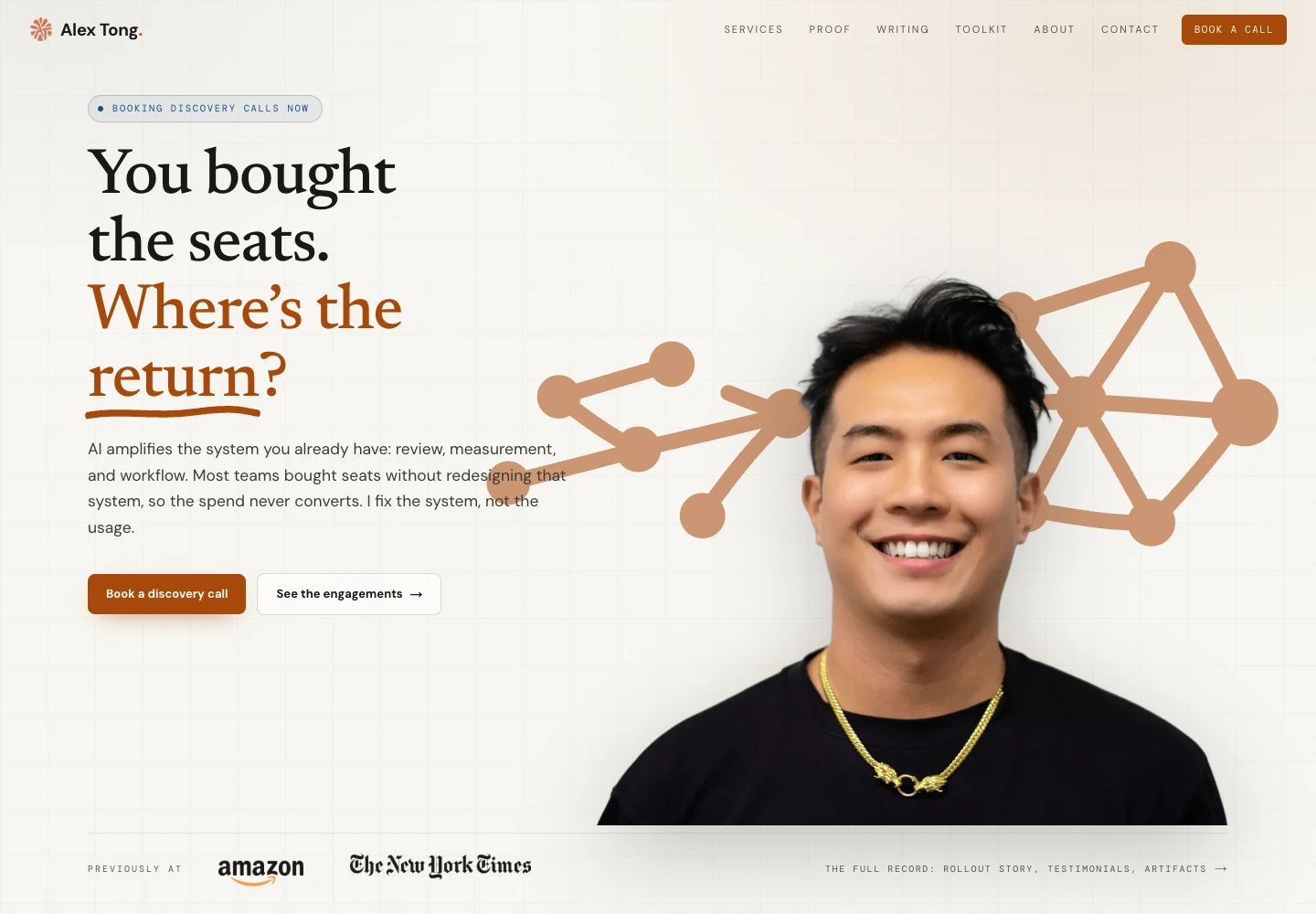
A clearer professional front door
The site needed to explain the work I could do for other people. Warm paper, amber accents, and editorial type made room for services and a more direct offer. The gothic world moved to its own address inside the site: the castle.
Warm paper · Services · Separate day and night experiences
08
Let the work lead.
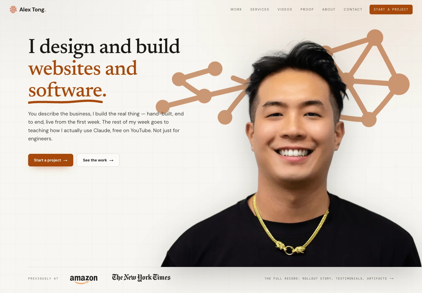
From explaining to showing
As client builds became the focus, the portfolio moved forward. The homepage was shortened, the offer became more direct, and a dedicated Work page gave projects a place of their own. Teaching and the castle stayed in the picture, with a clearer place for each.
Client builds · Project previews · A dedicated Work page
09
A site that shows the craft.
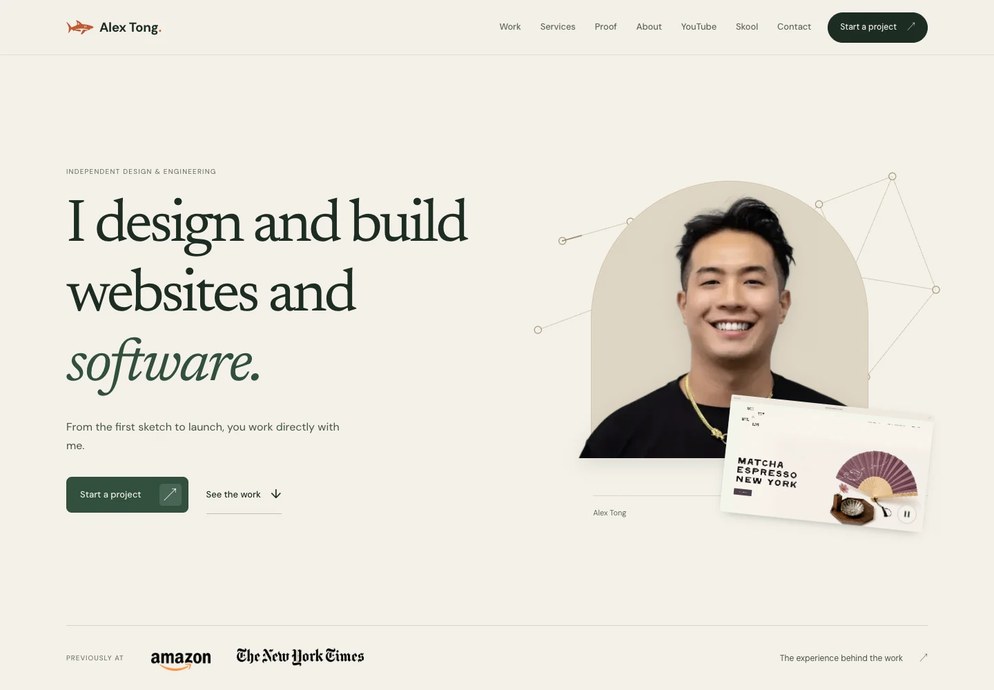
Design and engineering, together
Ivory and forest green set a quieter stage for the work. The portrait and small project window introduce the page; scrolling lets the client project take over. More deliberate spacing, a smaller identity mark, and a direct inquiry flow bring the site closer to the kind of work it offers.
Editorial composition · Scroll choreography · Direct inquiries
10
A clearer sense of self.
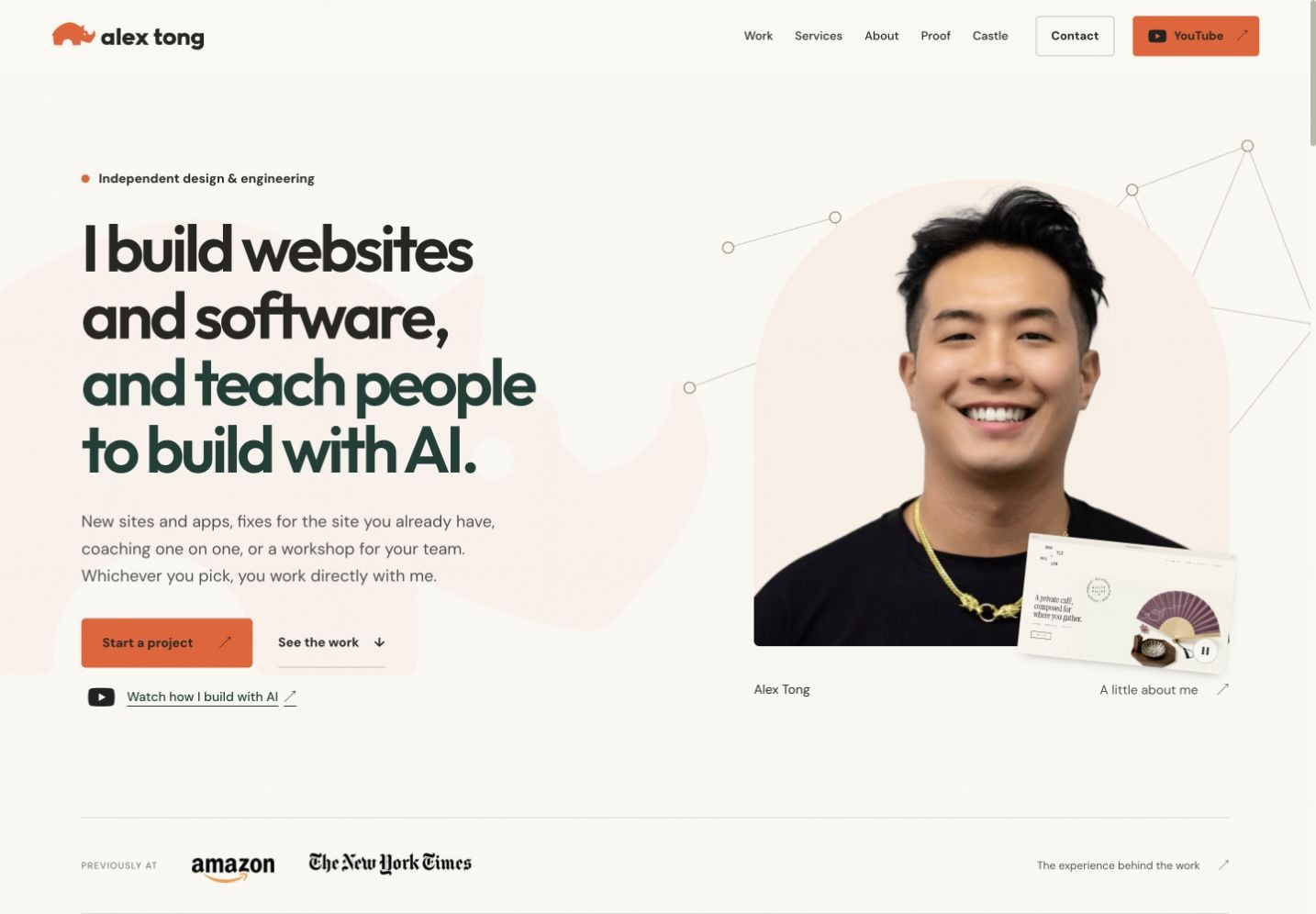
One identity, with room for the work
A compact rhino and lowercase wordmark gave the professional site a more distinct identity. Orange accents, warm paper, and the portrait carry through the pages. The homepage introduces both sides of my work: building websites and software, and teaching people to build with AI. Client work follows, alongside my contributions at Amazon and The New York Times. The fuller project archive and the castle have room on their own pages.
Rhino identity · Orange and warm paper · Selected professional work
Still here, still changing
Some chapters
stay open.
Ten design chapters from 2018 to September 2026, including the current rhino identity. The 2018 and Squarespace versions were rebuilt from Wayback Machine captures; the March and April 2026 screenshots were saved at the time; later versions were captured from their source. The archive includes identities, content, and offers that have since changed.